Good'ol 4:3 ratio. It's fine as long as you don't know what you're missing.
With so many HDTVs on the market and their 16:9 (width:height) ratios, music videos that were already shot in the widescreen format (condensed for your normal 4:3 TV ratio viewing) are now shown in widescreen no matter the TV you're using. The only way to fit a widescreen image on a 4:3 TV is by way of horizontal black bars on the top and bottom that fill the space sacrificed to make your 4:3 TV show a 16:9 picture. Conversely, a 4:3 picture on a 16:9 screen has vertical black bars.

A 16:9 picture is better than 4:3, so why do we need even more video?
The black bars have always done a fine job of creating that widescreen feel on your squarish TV. Unfortunately, some record exec got the ass-backward idea of filling in that black space with more images. The black bars are not "wasted space" since they create the 16:9 ratio and a better viewing environment, but apparently music video producers want to confuse viewers with overlapping images.

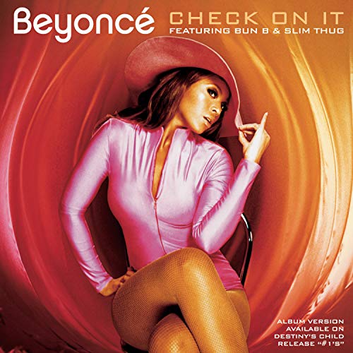
Call me crazy, but isn't a 16:9 picture of Beyonce enough to hold anyone's attention? We don't need the confusing extra video.
What happens when you add video where the black bars should be? When someone is singing in the widescreen portion, there'll be random things like martini glasses in the top and bottom bars. This makes it seem like the singer is balancing martini glasses on his/her head while those same martini glasses are being used on the bottom as step ladders for the singer. There's no need to take away from the main shot. We already get the idea that the singer likes martini glasses because they're all over the main video, so don't put them in the previously-empty space. When you watch Beyonce's "Check On It" video as she shakes her moneymaker, you'll see that it's fine without the sensory overload of other things in the top and bottom bars. Next time you watch a video, see if it's widescreen, and pray that the empty space remains empty.

1 comment:
there's still videos?
last time i tried to watch MTV (admittedly years ago) all I could ever find were reality TV shows...
Post a Comment